Meet the new bottom sheet in iOS 15
We can finally use the modal sheet that does not take up the entire screen on an iPhone. And it is just a bit of configuration.
Published: June 10, 2021 Sponsored See booksUpdated for Xcode 13 release build
If you have been doing UIKit long enough, you probably had to implement the so called "bottom sheet" at least once. These usually take bottom half of the screen and present some kind of secondary info.
Starting with iOS 15, this functionality is available natively for every view controller. The only requirements are modal presentation and some new customization options.
Note that "bottom sheet" isn't official Apple term, but I think it makes a lot of sense. The official terms are either "non-modal" or "resizable" sheet.
Anyway. Let's check it out.
Basic usage
If you wan't your view controller to be displayed as bottom sheet, there are two lines of code:
if let sheet = nvc.sheetPresentationController {
    sheet.detents = [.medium()]
}
And next you would use the present method.
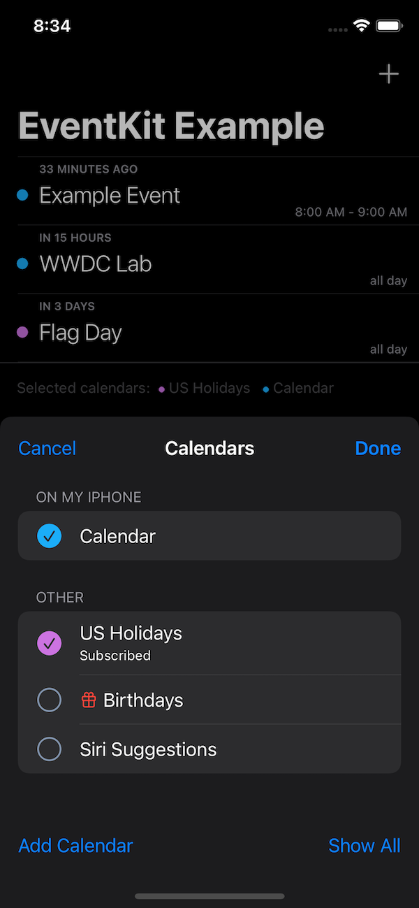
This is example from my EventKit project, and the result:

The EKCalendarChooser is now presented as a bottom sheet and does not take up the entire screen.
The sheetPresentationController will be available for all controllers that have the modalPresentationStyle set to either .pageSheet or .formSheet.
Small aside: These look the same on iPhone, but .formSheet is much smaller when presented on the iPad.
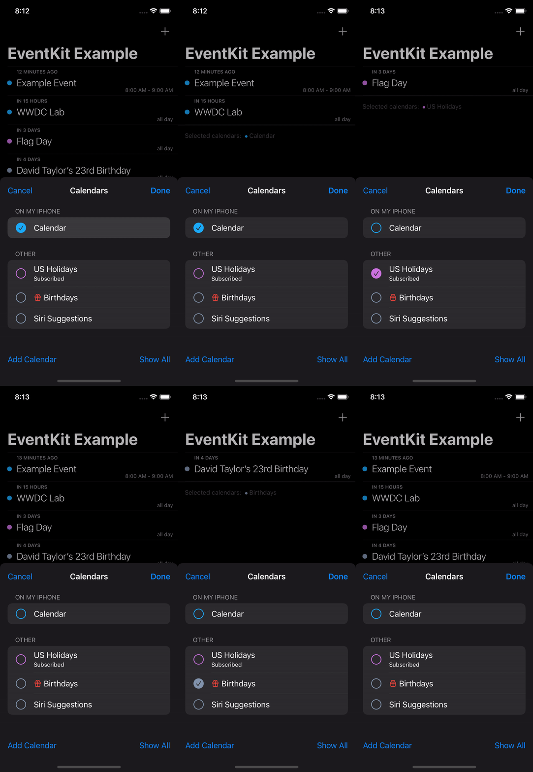
I have updated my EKCalendarChooser delegate code to use the calendarChooserSelectionDidChange and this shows when this bottom sheet makes sense:

It is great for these sorts of pickers where you can immediately show the results to your users.
Customizations
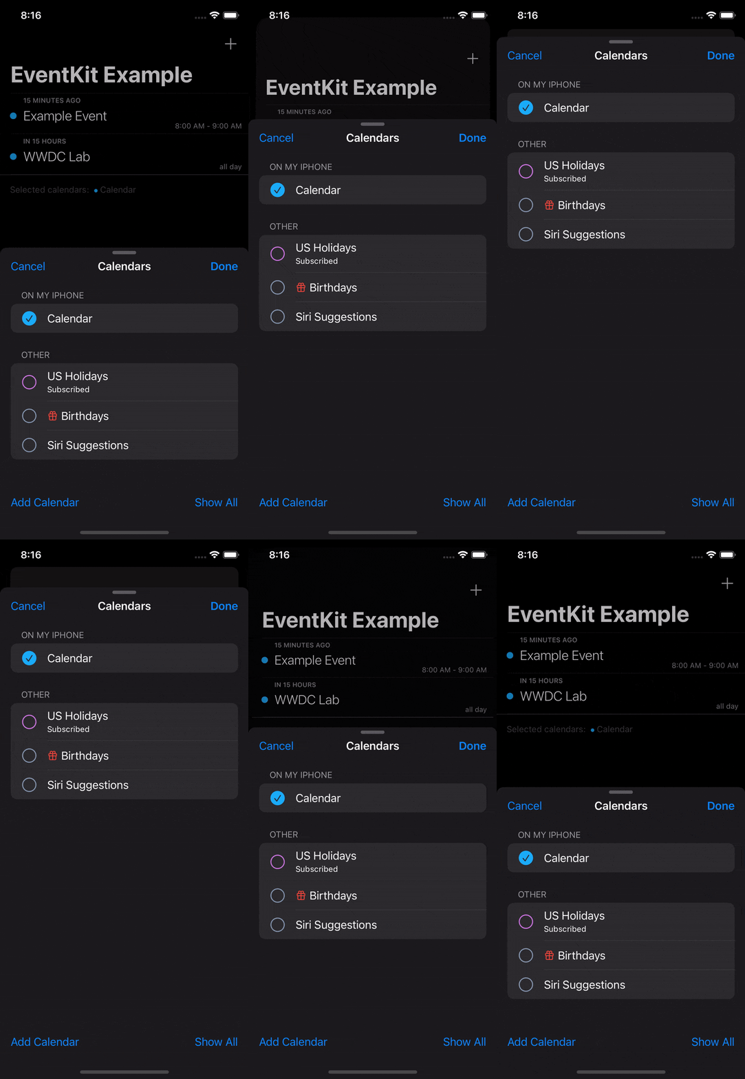
Let's customize the bottom sheet a little. If we allow both medium and large detents the screen is resizable by the user.
if let sheet = nvc.sheetPresentationController {
    sheet.detents = [.medium(), .large()]
    sheet.prefersGrabberVisible = true
}
I have also added the standard grabbing indicator, so users can discover the resizability.

There's another useful customization option. Currently when the sheet is in medium size, scrolling in the calendar list can resize it. In case we don't want that, there is one line to disable this behavior:
sheet.prefersScrollingExpandsWhenScrolledToEdge = false
That's what I call a descriptive name 😁
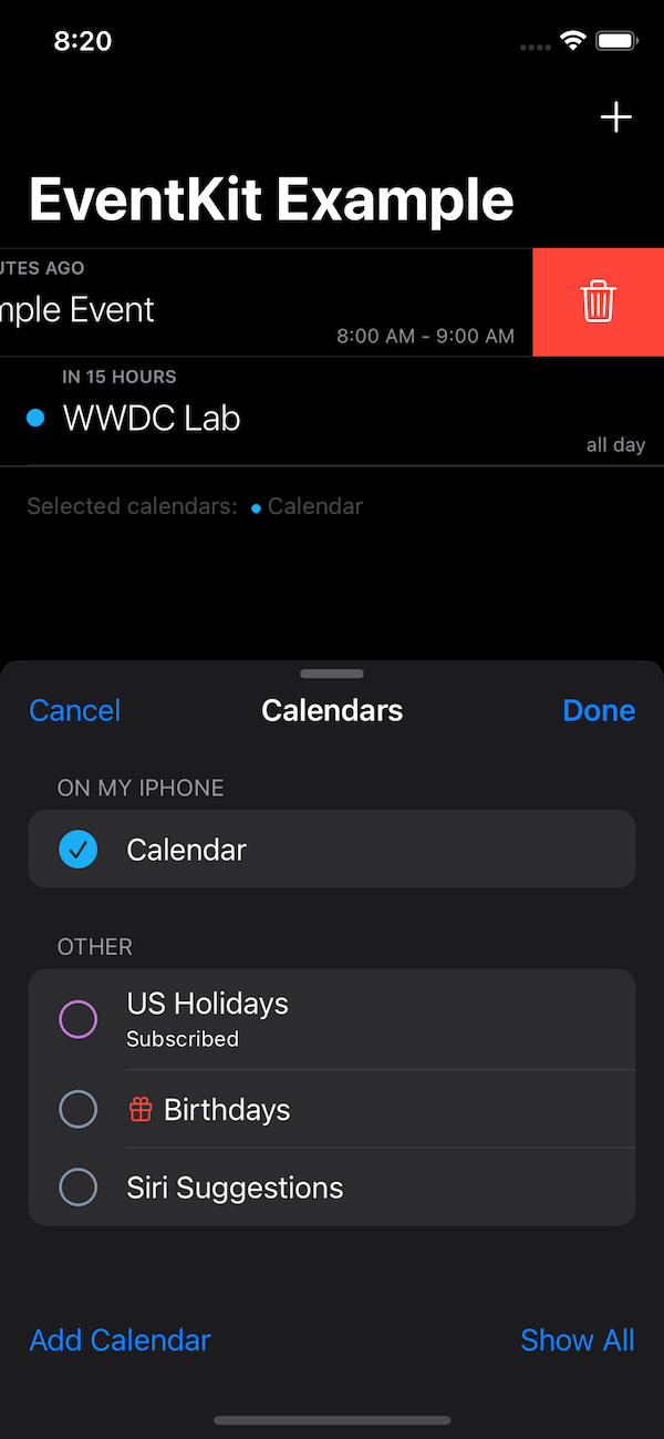
Another useful option is to disable the dimming effect when we have medium size active.
sheet.smallestUndimmedDetentIdentifier = .medium
This will not only remove the dimming but also let's you interact with the controller that is currently presenting the bottom sheet. So in my EventKit example I can filter events with the calendar chooser and delete them without closing the chooser.

Programmatically changing size
Maybe with your picker it makes sense to start with the full screen and then is user makes a selection (without also closing the picker) you can move to medium size and show the result.
To do this with our example, let's start with large detents.
if let sheet = nvc.sheetPresentationController {
    sheet.detents = [.large()]
    sheet.prefersGrabberVisible = true
    sheet.smallestUndimmedDetentIdentifier = .medium
}
And the second part will be in the delegate method:
if let sheet = calendarChooser.navigationController?.sheetPresentationController {
    sheet.animateChanges {
        sheet.detents = [.medium()]
    }
}
Note the animateChanges closure that will make sure we get smooth animation.
(apologies I just couldn't create working GIF, because this requires the start to be static for at least a couple of seconds and the converters remove this part and then the result is jarring)
The rest
If your app has design with prominent rounded corners, you can customize the bottom sheet to match:
sheet.preferredCornerRadius = 24
There are also customization options for landscape on iPhone and bottom sheet works a bit different on an iPad in split view. Check the WWDC session for these.
Thanks for reading!
Uses: Xcode 13 & Swift 5.5

