Always correct gradient text in UIKit
Applying gradient colors to UILabel text isn't straightforward. Let's see how to do it.
Published: Feb. 6, 2022 Sponsored DetailsThis was supposed to be a super short post about how to easily achieve gradient text with UILabel in UIKit. 🙈 Gradient text is something I am not using that often to remember how to do it quickly, so I wanted a quick reference guide to help myself and others in the future.
However, I discovered that my solution had a pretty big flaw. I think it makes sense to go over it to understand why it happens and how to gradient text correctly without too much hassle.
The basic solution
Let's start with what I had in mind initially. Since you can create UIColor from UIImage, you can render the gradient and set it as textColor of your UILabel and voila! You have gradient text.
Below is the extension that I used:
extension UIImage {
    static func gradientImage(bounds: CGRect, colors: [UIColor]) -> UIImage {
        let gradientLayer = CAGradientLayer()
        gradientLayer.frame = bounds
        gradientLayer.colors = colors.map(\.cgColor)
        // This makes it left to right, default is top to bottom
        gradientLayer.startPoint = CGPoint(x: 0.0, y: 0.5)
        gradientLayer.endPoint = CGPoint(x: 1.0, y: 0.5)

        let renderer = UIGraphicsImageRenderer(bounds: bounds)

        return renderer.image { ctx in
            gradientLayer.render(in: ctx.cgContext)
        }
    }
}
And let's quickly go over the usage:
let gradient = UIImage.gradientImage(bounds: gradientLabel.bounds, colors: [.systemBlue, .systemRed])
gradientLabel.textColor = UIColor(patternImage: gradient)
If you drop UILabel in a view controller or a Playground and use this code, you will get nice-looking gradient text. However, in most real cases, you will run into an issue.
The problem
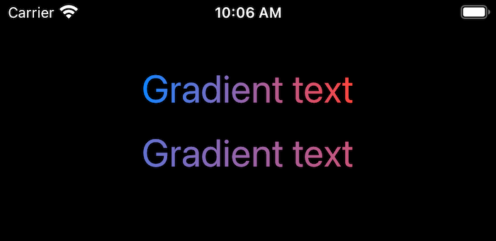
Let's see the problem visually. Below are two labels; both use the same method to create the gradient text.

Want to take a moment to think, why is this?
Or just skip below :-)
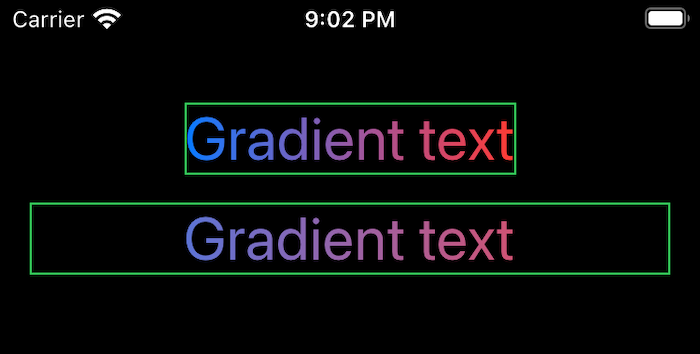
It is all about the frame of each UILabel versus the actual text content. The bottom label is constrained via leading and trailing anchors to be 16pt from each side. This will prevent it from going off-screen should we display longer text.
This means we are using much wider bounds when creating the gradient => the text shows just a part of the entire gradient.
To visualize this, I have added borders to both labels:

These "washed out" colors mostly happen with horizontal gradients. If we had a vertical one, I think this wouldn't be a problem in most cases.
The solution(s)
Solutions depend on how complicated your layout for the gradient text is. If you are sure it will never go off-screen, you can center it with AutoLayout and don't worry about the frame being larger than the text. It will work fine.
Another option is to use "Greater than or equal" constraints for the leading and trailing anchors, which is what the correct gradient in my example uses.
If these options don't work, we need to move to more complex solutions.
One of them that I saw a lot is creating parent UIView, adding the CAGradientLayer (without rendering it to an image) as sublayer, and then masking it to UILabel you add as a subview to the parent view. This is quite cumbersome in my view and requires a lot of code to work with sizes of the label and repositioning the gradient layer. This is (likely) also the only option if you need to animate the gradient.
StackView to the rescue
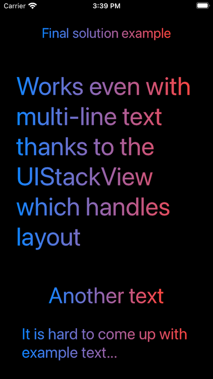
Since UIStackView can automatically do a lot of layout for us, why not use it for gradient? We can subclass it and use the entire StackView to correctly layout UILabel without its bounds being larger than actual text content. This will also work for multiline text.
Below is basic implementation:
class GradientLabel: UIStackView {
      lazy var label: UILabel = {
        let label = UILabel()
        label.numberOfLines = 0
        label.font = UIFont.boldSystemFont(ofSize: 32)
        return label
    }()
    override init(frame: CGRect) {
        super.init(frame: frame)
        setupView()
    }

    required init(coder: NSCoder) {
        super.init(coder: coder)
        setupView()
    }

    private func setupView() {
        axis = .vertical
        alignment = .center

        addArrangedSubview(label)
    }

    override func layoutSubviews() {
        super.layoutSubviews()

        let gradient = UIImage.gradientImage(bounds: label.bounds, colors: [.systemBlue, .systemRed])
        label.textColor = UIColor(patternImage: gradient)
    }
}
The critical part is creating the gradient in layoutSubviews to ensure correct bounds. It would make sense to make the colors a property to support customization in a real project. You could also perhaps make label private and create small wrappers around needed functionality.
See below a few gradient texts using this GradientLabel.

Summary
This actually wasn't as long as I feared when I discovered that the basic solution works only in some cases.
There is one crucial thing to keep in mind. You need to render the gradient for your label as a very last step! Only then will the bounds be correct for the current text. If you change the text of the label, you should re-render the gradient for best results.
I think this is enough UIKit gradients for me for at least a month.
PS: The above solution isn't only for UILabel. It will work for UITextView as well.

