SwiftUI Tip: Always correct corner radius for subviews
Meet ContainerRelativeShape!
Published: Jan. 2, 2023 Sponsored DetailsWhile working on widgets for SwitchBuddy, I found a great way to have nicely-looking rounded corners for views inside my widgets without manually specifying and tweaking the cornerRadius.
The answer is named ContainerRelativeShape and has been available since iOS 14. This clever little shape is used with the clipShape modifier, and its appearance is based on the parent view.
When you have a parent view with a corner radius, its subviews should have a smaller corner radius so it doesn’t look weird. Ideally, it would be best to look at the paddings before deciding which corner radius to use.
But fortunately, we don’t have to! This shape takes it all into account without us doing any more work. I don’t think I will use anything else in this context because the result looks nice, and you don’t have to change anything when adjusting paddings inside the view.
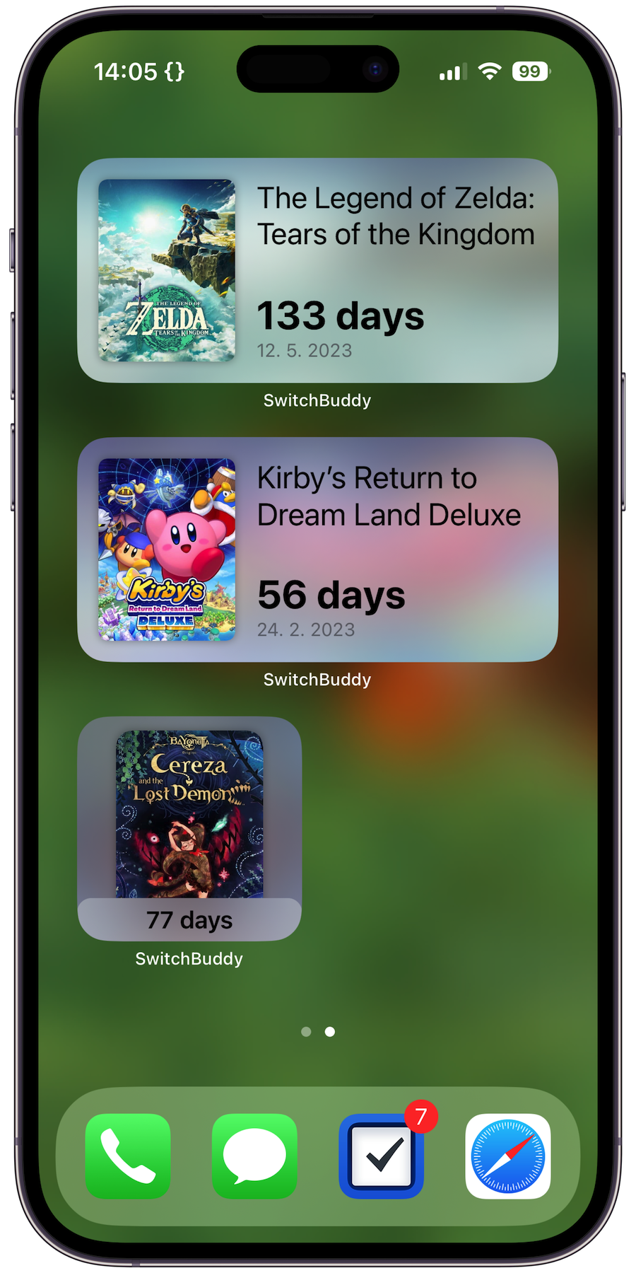
In the below screenshot, all the game cover views use this shape:

Notice how the corner radius is different in the small and medium widgets. Thanks to ContainerRelativeShape.
In code, it looks like this:
coverView(for: game.id)
    .resizable()
    .aspectRatio(contentMode: .fit)
    .clipShape(ContainerRelativeShape())
And that’s it! May your corner radii always look great 😃

