UX Diary: Onboarding without onboarding
About an approach I took in "GameWidgets" to better onboarding users into the app.
Published: Aug. 2, 2023 Sponsored See booksI am trying a new article format about my "UX learnings" from my development. It may be helpful to someone.
This first foray into writing about UX concerns my "Game Widgets" app, which may soon be renamed to be more descriptive. The impulse to rethink the initial user experience came during one of WWDC Labs when the people from Apple mentioned that it might be difficult to know what to do when you first open the app.
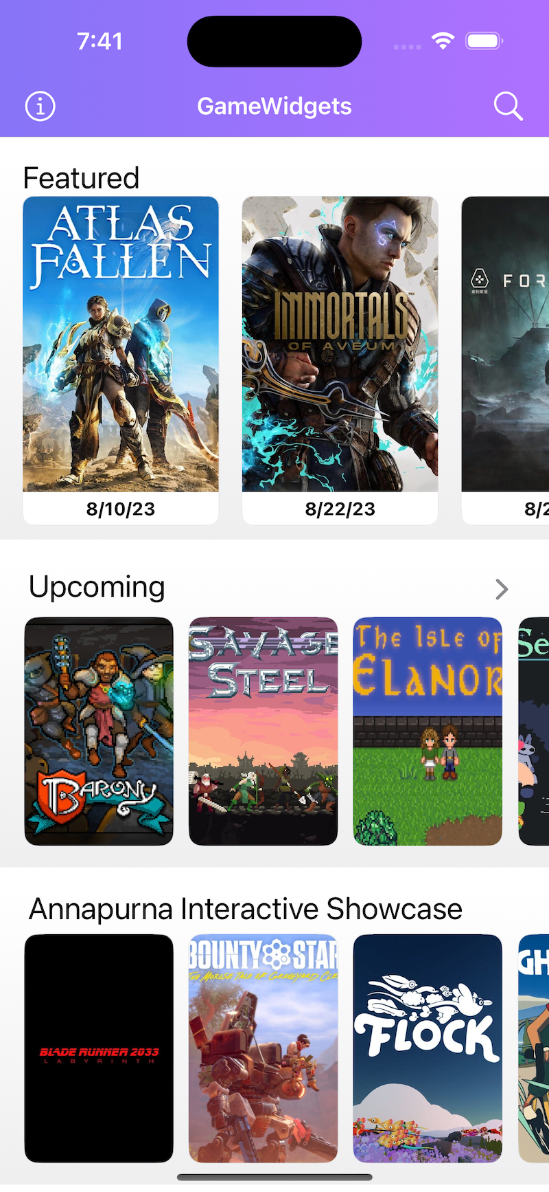
Below is what the initial version looked like:

For most users, the first step would be to check out upcoming games and "favorite" those they were interested in. Having at least one favorite game made the widgets useful.
I considered traditional onboarding, where you show a couple of screens on the first launch to sort of describe what to do in your app. I don't like these onboardings as a user, nor do I enjoy building them as a developer.
This reluctance to create standard onboarding pushed me to think about other (possibly easier) solutions. I customized the main screen for new users to guide them on what the app expects.
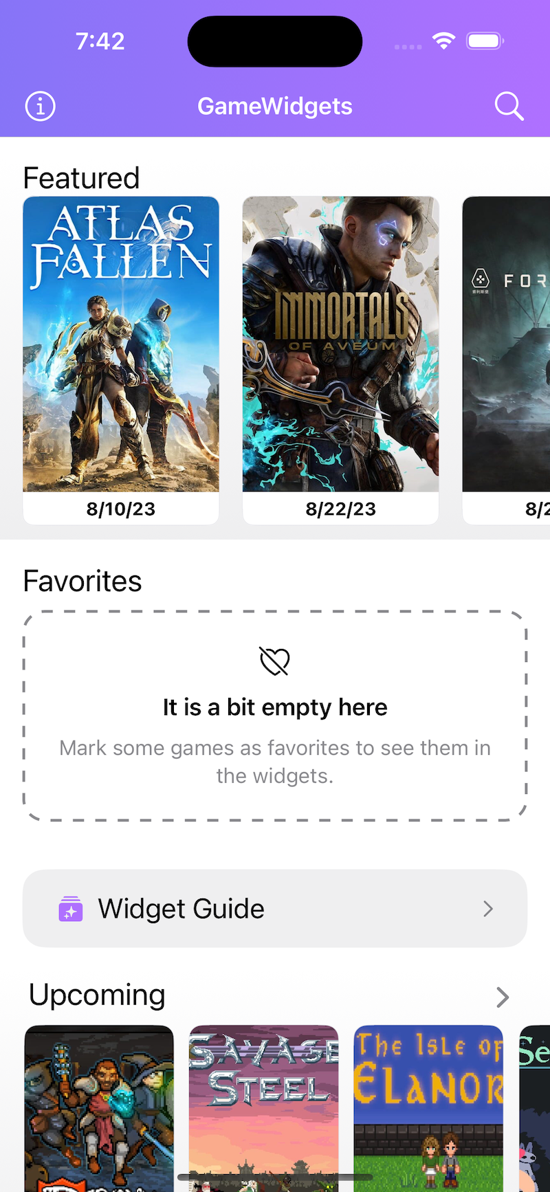
Instead of showing the "Favorites" section only after they favorite their first game, I show it immediately with a placeholder view explaining the deal with favoriting games.
Another improvement that I made was to make my existing widget guide screen more prominent. It was available from the About section. I have added logic to check if the user has a widget installed on their Home Screen, and if not, I am showing the widget guide entry point prominently on the main screen just below the favorites.
And here is the result:

I have since tried using this "onboarding without onboarding" approach in more places. For example, when I added a wishlist section to Favorite games in SwitchBuddy, I created a similar placeholder view explaining the feature. Users can even tap it to see more info, along with a sample UI showing how adding to the wishlist works.

