Porting iPhone app to iPad: My experience
Tips and approaches to use when you don't have the time to build iPad version from scratch.
Published: Oct. 28, 2020 SponsoredDiscover new games to play, organize your library, read reviews and more.
I have been recently working on an iPad version of an iPhone app that has been in development for more than a year. The app in question was developed by approximately 1,3 developers full-time during this time.
In this post I would like to share my experience of creating the iPad optimised version. That in the end took around 60-70 hours of work. Which I think is not bad considering the original app is pretty big and wasn't developed to be iPad ready.
I am not sure how much should I reveal about the app, so I decide to write about it in an abstract way. Hopefully that wont be a problem in this post. My goal is to show simple strategies you can use to bring iPhone only app to the big screen of iPad in comparatively little time. Of course the end result is not perfect and some parts of the app betray that it is iPhone first app. However you can still get great results.
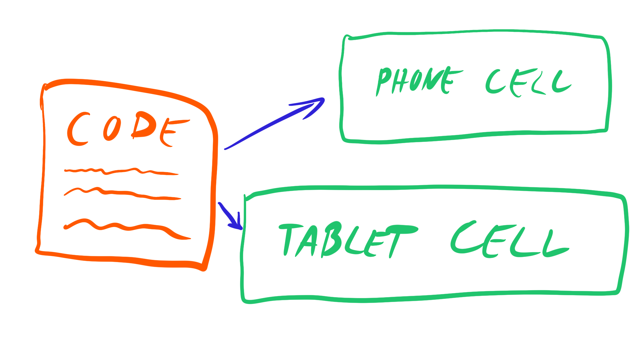
Backwards compatible sidebar for iPad
The iPhone app uses tab bar interface and for iPad we decided to make use of sidebar. Which is great, because it automatically limits horizontal space that is hard to fill with content.
It turns out the new iPadOS 14 sidebar is the trusty old UISplitViewController. So we used that to create our own sidebar backwards compatible with iOS 12. We have turned the detail screen into container for other view controllers and that was big part of this done. The rest of sidebar was primarily iPadOS 14 design and manually showing and hiding the sidebar on rotation.
Since the app presents a lot of various content from an API we did not have too much issues with figuring out how to fill the screen with content. It was mainly question how to optimise existing content for a big screen.
Bigger margins, custom cells design, non-abbreviated content
There are few relative cheap (time-wise) ways to make existing view controllers and views look good on an iPad screen. One of the are bigger horizontal margins for all content.
Since our app uses a lot of TableViews this meant setting bigger leading and trailing margins for content. Since most of the cells used our own inset styles because of iOS 12, I could just conditionally set bigger constraints. Sometimes you can also consider setting margins to whole TableView on iPads but then the scroll indicator is not close to the edge of the screen.
For more complex cells I would create iPad versions and then dequeue them with modified reuse identifier which meant that the code for the cells could stay the same. This was another nice time-saver which allowed to have completely different design on iPad.
Sometimes the changes were more subtle. For example since you have a lot more space, we would display entire day names instead of an abbreviation of longer dates. Or instead of using just codes for city, we would show the name and so on. In other instances the iPad version would have longer graphics, for example arrows indicating direction, iPad screen also sometimes meant changing the aspect ratio of photos and using higher resolutions.

Popovers, form sheets and page sheets
Another easy solution is to change how are view controllers presented (via the .modalPresentationStyle property). For example I have changed a lot fullscreen ones to being either .pageSheet or .formSheet. Because in most cases our iPhone fullscreen view controllers did not have enough content to fill the iPad screen, so we would display it as a modal in the middle of the screen. On iPad you can also use .formSheet which acts like modal but is approximately half the size. This is great because it does not cover the whole modal beneath it and small amount of content looks great here.
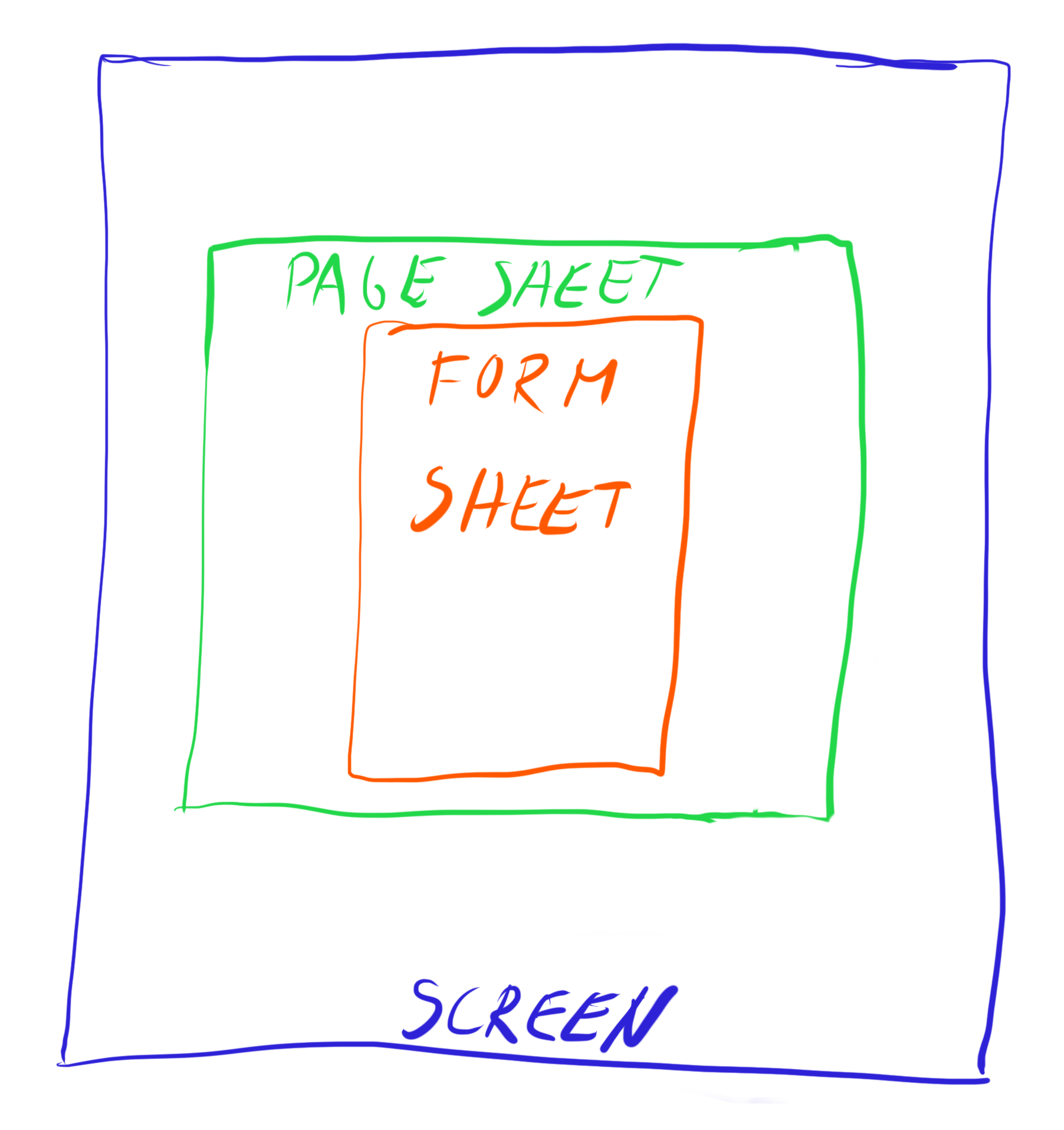
The last option from these are popovers. These are tiny bit complicated because you need to specify anchors, much like when using UIAlertController as .actionSheet on iPad. We used those mainly for displaying user-interactive selections and settings that would be modal sheet on an iPhone.
Recap
So to recap. We created iPad version for iPhone by creating sidebar as the main navigation, creating new table view cells for iPad, increasing horizontal margins and changing how modal view controllers are presented. None of these were terribly time consuming and the result is an app that works pretty good on an iPad screen.
If you are working on UIKit app that is currently only for iPhone I would suggest creating your own inner content view when building new table view and collection view cells as this may be an easy way in the future to increase margins and make the app look better on an iPad.
Thanks for reading.
Uses: Xcode 12 & Swift 5.3
Follow on Bluesky to not miss new posts

iOS blogger and developer with interest in Python/Django.