Basic anatomy of collection view compositional layout
Understanding the basic building blocks of the great compositional layout for collection views.
Published: Nov. 21, 2020 Sponsored See booksThe new collection view compositional layout available in iOS 13 and up represents significant shift from the old way of creating complex collection views layouts. It is a declarative approach to building complex layouts with UICollectionView. I plan to give this topic a lot of space on my blog and in this introductory post, I want to introduce all the important classes and how they relate to each other.
UICollectionViewCompositionalLayout
At the top sits the UICollectionViewCompositionalLayout which can be set on UICollectionView with the setCollectionViewLayout method. This change can be animated which is great when we want to change the size of the items for example.
UICollectionViewCompositionalLayout has two main initializers. One takes parameter section: which is of type NSCollectionLayoutSection and the other takes sectionProvider: which is basically a closure that lets us provide different sections based on the indexPath.
Most of the types we will meet soon have the NS prefix, because they are not specific to the iOS, and you will also meet them when working on new macOS apps.
NSCollectionLayoutSection
When we want to create compositional layout, we need to provide NSCollectionLayoutSection either directly or via the section provider.
This represents the standard section we know from table views and collection views. This class has a number of important properties to customize how the section looks like and behaves.
For example there is property orthogonalScrollingBehavior which when set to anything else than .none makes the whole section scroll horizontally. You can easily achieve horizontal paging by setting it to .groupPagingCentered.
Next we have boundarySupplementaryItems property. This is used to define that particular section has header and/or footer and also dimensions. Collection view will then automatically call the corresponding data source method so you can dequeue and configure these views.
There are a few others but I want to keep this post short.
To construct a instance of NSCollectionLayoutSection we need an instance of NSCollectionLayoutGroup...
NSCollectionLayoutGroup
We are moving closer to the individual items. Groups are used to define how the items in particular sections are arranged. I think from the parts we are going to cover, this is probably the most complex because groups determine so much stuff regarding sizes and positions.
While the basic group is basically just a wrapper around individual layout items, it can get pretty complicated. You can also nest groups and this is the way to create complex layout.

For example one big grid item using 50% available width and the remaining 50% width being allocated evenly to four small items.
More complex groups are essential when you have horizontal section and want to have more than one row.
I think I will prepare more in-depth blog post just about NSCollectionLayoutGroup because this is really complex and has a lot of options.
There are two main methods to create NSCollectionLayoutGroup available on the class itself and these are .horizontal and .vertical and as you may guess, these are used to create horizontal and vertical groups. The third is .custom if you want really custom layout.
In both cases you need to pass in an instance of NSCollectionLayoutSize to specify the size of the group and array of NSCollectionLayoutItem. In simple cases this is just one item which brings us to the last piece of the puzzle.
NSCollectionLayoutItem
NSCollectionLayoutItem is the basic building block of compositional layout. Just like the sections we covered map directly to the sections from your data source, NSCollectionLayoutItems map directly to the data source items. You configure this item with size and then use it to create group explained above. We also have pretty nice API for configuring sizes.
The item expects instance of NSCollectionLayoutSize, which is also used to configure sizes of the groups. There are three ways to configure sizes. We have .estimated, .absolute and .fractional(Width|Height). If you want your item to take whole width of the collection view, you just set .fractionalWidth(1.0) and done. Same if you want to have four items side by side, you can set .fractionalWidth(0.2) and compositional layout will do the rest. It is pretty powerful.
I think this could be it for basic introduction to the compositional layout. I will reference this post in future ones which will delve into building all kinds of layouts, using headers, footers and other "supplementary" views for the collection view.
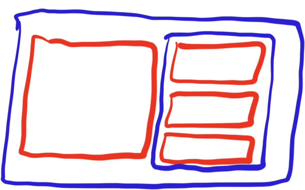
And just to recap the structure which is the core of compositional layout:
Layout -> Section -> Group -> Item
Uses: Xcode 12 & Swift 5.3
Follow on Bluesky to not miss new posts

iOS blogger and developer with interest in Python/Django.