Building Instagram profile screen with Compositional Layout
Let's build the profile page with avatar, followers count, highlights and photos.
Published: Jan. 18, 2021 Sponsored See booksI have written about Compositional Layout quite a bit already, but always in an abstract way describing the individual part. In this post I want to try something totally different and more practical.
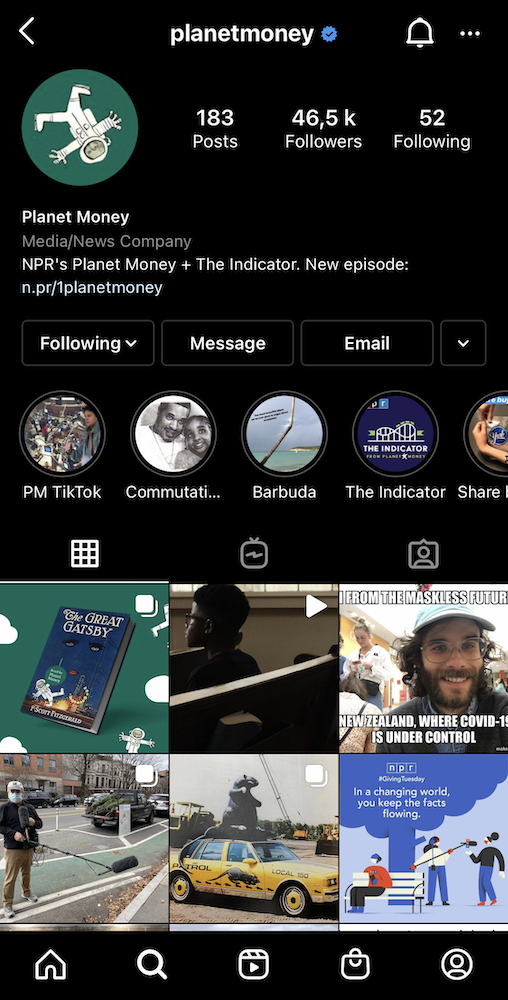
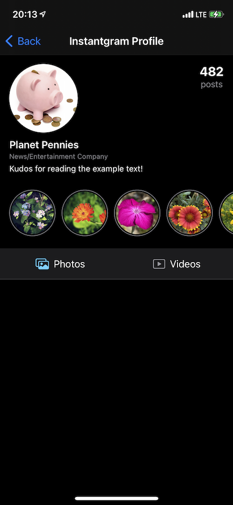
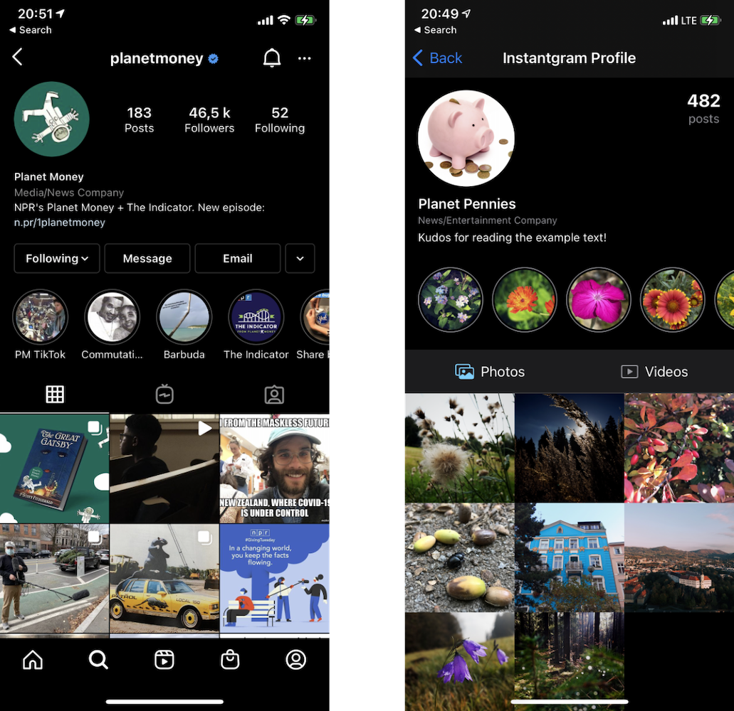
I am going to show how we could build screen similar to the Instagram profile detail. I have choosen Instagram because it is a popular, well-known app and the profile offers an opportunity to really showcase compositional layout.
This is the current design:
When building complex screens such as this, it is best to start by mentally "slicing" the screen into individual components.
One way to slice this screen, would be something like this:
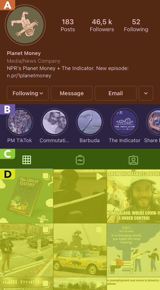
I have highlighted the individual parts with colors and also with letters to make it clear what I am referring to.
The header ("A") could be sliced even more. Here this depends on how we might want to use it elsewhere. If we wanted to maybe show it without the buttons ("Following", "Message", etc). Then these buttons would work better as separate cell or footer view. Even though this is the header, we are going to use cell for it. Because accessing data is cleaner and reusing it will be easier with cell than with header (or rather supplementary).
In this example we are going to build simpler header because the precise UI is not the point. My goal with this post is not to show how to copy Instagram but rather how to deconstruct complex screen and build it with compositional layout and diffable data source.
The highlights part ("B") is pretty straightforward. This is a horizontal section where each highlight is collection view cell.
Moving down we have header used to toggle what the rest of the screen displays ("C"). We could either build this as a cell or header for the section. I will go with header because I want to show it as part of the tutorial and it does not require any data.
The last section ("D") will be vertical section with three items on each row. These are going to be cells.
Implementation
Now we have an overview of the parts, we can begin implementing the screen. I will build it in chunks so we can continually test the screen and see how it looks like.
I am going to use Storyboard, mainly because it is faster and I can easily screenshot progress.
The cells itself would be better either 100% in code or as separate .xib files so they can be reused. Since this is an example, I will create them in the storyboard.
With prepared cell for the header:
We can move to the more interesting part and define our compositional layout together with the diffable data source.
Here are the basic steps needed for the initial setup:
- Create definition of compositional layout (with single section for now)
- Create diffable data source
- Create snapshot with demo data
Header layout definition
// MARK: Layout
extension InstantgramViewController {
    func createLayout() -> UICollectionViewLayout {
        let headerItem = NSCollectionLayoutItem(layoutSize: NSCollectionLayoutSize(widthDimension: .fractionalWidth(1.0), heightDimension: .fractionalHeight(1.0)))
        let headerGroup = NSCollectionLayoutGroup.horizontal(layoutSize: NSCollectionLayoutSize(widthDimension: .fractionalWidth(1.0), heightDimension: .fractionalHeight(0.3)), subitems: [headerItem])
        let headerSection = NSCollectionLayoutSection(group: headerGroup)

        return UICollectionViewCompositionalLayout { (index, environment) -> NSCollectionLayoutSection? in
            return headerSection
        }
    }
}
It is a lot of code because we need to define the item, the group and the section. With the size:
let headerGroup = NSCollectionLayoutGroup.horizontal(layoutSize: NSCollectionLayoutSize(widthDimension: .fractionalWidth(1.0), heightDimension: .fractionalHeight(0.3)), subitems: [headerItem])
We are telling the layout that we want the item to take 30% of the available height. Notice we are specifying this on the group and not on the item. We will have just one item in this section and that item will take the entire size of the group.
Diffable sections and items
Next we start by defining our diffable data source. First with enums for sections and items:
enum Section: Hashable {
    case header
}

enum Item: Hashable {
    case header(ProfileHeaderData)
}
We are concerned just with the header for now.
The ProfileHeaderData is simple struct to contain data needed for the header:
struct ProfileHeaderData: Hashable {
    let name: String
    let accountType: String
    let postCount: Int
}
We get Hashable synthesized which means we get automatic refresh if we create new snapshot and any of these properties has a new value.
Next we can define typealiases:
typealias Datasource = UICollectionViewDiffableDataSource<Section, Item>
typealias Snapshot = NSDiffableDataSourceSnapshot<Section, Item>
This is something I like to do because it makes the code cleaner and easier to change.
Create diffable data source
We can now actually create our diffable data source. First we create property:
private var datasource: Datasource!
And before we instantiate it, we need to prepare method that will return collection view cells.
private func cell(collectionView: UICollectionView, indexPath: IndexPath, item: Item) -> UICollectionViewCell {
    switch item {
    case .header(let data):
        let cell = collectionView.dequeueReusableCell(withReuseIdentifier: ProfileHeaderCell.reuseIdentifier, for: indexPath) as! ProfileHeaderCell
        cell.configure(with: data)
        return cell
    }
}
So far we have just single case in the Item enum so the switch is quite simple. We will return later to this method and prepare handling for other types of cells.
And finally we are able to create the datasource instance:
private func configureDatasource() {
        datasource = Datasource(collectionView: collectionView, cellProvider: cell(collectionView:indexPath:item:))
}
Now we can call it in viewDidLoad and also set the layout:
override func viewDidLoad() {
    super.viewDidLoad()
    collectionView.setCollectionViewLayout(createLayout(), animated: false)
    configureDatasource()
}
And we are almost ready.
Creating snapshot
To display anything using diffable data source we need to create a snapshot of the data we want to display.
func snapshot() -> Snapshot {
    var snapshot = Snapshot()

    snapshot.appendSections([.header])
    snapshot.appendItems([.header(demoProfileData)], toSection: .header)

    return snapshot
}
For now this is just the header. Similar to the method for returning cells, snapshot() is another place we will be returning often to extend. Now we just need to go to configureDatasource and apply the initial snapshot:
datasource.apply(snapshot(), animatingDifferences: false)
Since this is the initial load, there is no point in animating it.
And finally we can run the app and check the work in progress:

I know it is not much relative to the effort, but a lot of the code was necessary preparation and the subsequent sections will be way easier.
Small refactoring
Before we move on, I want to clean up the layout code a bit. There is no reason to have single big method createLayout. We can move the section code to dedicated method like this:
func createHeaderSection() -> NSCollectionLayoutSection {
    let headerItem = NSCollectionLayoutItem(layoutSize: NSCollectionLayoutSize(widthDimension: .fractionalWidth(1.0), heightDimension: .fractionalHeight(1.0)))
    let headerGroup = NSCollectionLayoutGroup.horizontal(layoutSize: NSCollectionLayoutSize(widthDimension: .fractionalWidth(1.0), heightDimension: .fractionalHeight(0.3)), subitems: [headerItem])

    return NSCollectionLayoutSection(group: headerGroup)
}
And updated createLayout:
func createLayout() -> UICollectionViewLayout {
    return UICollectionViewCompositionalLayout { (index, environment) -> NSCollectionLayoutSection? in
        return self.createHeaderSection()
    }
}
In fact, lets go a step further and ditch the closure. We can prepare method with the same signature as the closure above:
func sectionFor(index: Int, environment: NSCollectionLayoutEnvironment) -> NSCollectionLayoutSection {
    return createHeaderSection()
}
And set it as the sectionProvider parameter:
func createLayout() -> UICollectionViewLayout {
    return UICollectionViewCompositionalLayout { [unowned self] index, env in
        return self.sectionFor(index: index, environment: env)
    }
}
With this out of the way, we are much better positioned for creating a new section definitions.
Building the highlights section
If we take another look at the Instagram profile, we see that header is done and next is section of highlights that lets us scroll horizontally.
I went ahead and prepared ProfileHighlightCell to display the highlights. This cell has just single (bit inset) image view and that's it.
We can start by defining our layout:
func createHighlightsSection() -> NSCollectionLayoutSection {
    let item = NSCollectionLayoutItem(layoutSize: NSCollectionLayoutSize(widthDimension: .fractionalWidth(0.2), heightDimension: .fractionalWidth(0.22)))
    item.contentInsets = .init(horizontal: 5, vertical: 0)

    let group = NSCollectionLayoutGroup.horizontal(layoutSize: NSCollectionLayoutSize(widthDimension: .fractionalWidth(0.9), heightDimension: .estimated(100)), subitem: item, count: 4)

    let section = NSCollectionLayoutSection(group: group)
    section.contentInsets = .init(top: 0, leading: 10, bottom: 20, trailing: 0)
    section.orthogonalScrollingBehavior = .continuous

    return section
}
This is a bit complicated. We have this width for our group: .fractionalWidth(0.9) which ensures that the user can see a part of the fifth item and therefore know that they can scroll. This is also why I have .fractionalWidth(0.22) for the item height to compensate. I couldn't get a perfect circles otherwise.
The horizontal scrolling? This is all thanks to this property section.orthogonalScrollingBehavior = .continuous.
And before we can change the sectionFor method to dynamically return different sections, we need to define new case in Section enum, along with new Item case:
enum Section: Hashable {
    case header
    case highlights
}

enum Item: Hashable {
    case header(ProfileHeaderData)
    case highlight(ProfileHighlight)
}
We are using the similar pattern. Here is the new struct to hold our data:
struct ProfileHighlight: Hashable {
    let id = UUID()
    let image: UIImage
}

extension ProfileHighlight {
    func hash(into hasher: inout Hasher) {
        hasher.combine(id)
    }
}
To satisfy Hashable I have added id property.
And with the section definition in place, we can update the layout method:
func sectionFor(index: Int, environment: NSCollectionLayoutEnvironment) -> NSCollectionLayoutSection {
    let section = datasource.snapshot().sectionIdentifiers[index]

    switch section {
    case .header:
        return createHeaderSection()
    case .highlights:
        return createHighlightsSection()
    }
}
Notice that we are now pulling the actual section from the datasource so we can return correct layout definition.
And of course we need to update our method that returns the cells:
case .highlight(let data):
        let cell = collectionView.dequeueReusableCell(withReuseIdentifier: ProfileHighlightCell.reuseIdentifier, for: indexPath) as! ProfileHighlightCell
        cell.configure(with: data)
        return cell
For the sake of brevity, I am showing just the new case instead the whole method.
With all of this in place, there is one thing left to do and that is to update our snaphot() method.
The following code goes before the return:
snapshot.appendSections([.highlights])
snapshot.appendItems(ProfileHighlight.demoHighlights.map({ Item.highlight($0) }), toSection: .highlights)
The demoHighlights property returns mock items so we have something to display in our collection view.
And lets run the app now:
We basically have half of the screen done 🙂
Header for next section
We can name the last section "photos" for example and modify the Section enum:
enum Section: Hashable {
    case header
    case highlights
    case photos
}
This immediately forces us to change the switch in the sectionFor method. But for now we can either modify the first case to also include photos or create dedicated case for photos and return one of the section layouts we already have.
We are focusing on the header part right now. For demo purposes I have created ProfilePhotosHeaderView that mimics the options to toggle between photos and videos.
To use it, we first need to register it with our collection view in viewDidLoad like so:
collectionView.register(ProfilePhotosHeaderView.nib, forSupplementaryViewOfKind: UICollectionView.elementKindSectionHeader, withReuseIdentifier: ProfilePhotosHeaderView.reuseIdentifier)
The nib property is from my helper protocol to support easy instantiation of views from .xib files:
protocol InstantiatesFromNib: class {
    func setupView()
}

extension InstantiatesFromNib where Self: UIView {
    static var nib: UINib {
        return UINib(nibName: String(describing: Self.self), bundle: nil)
    }

    static func instanceFromNib() -> Self {
        let view = nib.instantiate(withOwner: nil, options: nil)[0] as! Self
        view.setupView()
        return view
    }

    func setupView() {
    }
}
Our next job is to prepare our diffable data source to return this view. Similarly as we did for the cells, we can create method to return supplementary views.
private func supplementary(collectionView: UICollectionView, kind: String, indexPath: IndexPath) -> UICollectionReusableView {
        return collectionView.dequeueReusableSupplementaryView(ofKind: UICollectionView.elementKindSectionHeader, withReuseIdentifier: ProfilePhotosHeaderView.reuseIdentifier, for: indexPath)
}
We have just one type of supplementary view, so we don't have to have any logic to distinguish between them.
Next we modify the configureDatasource to use this method for supplementary views:
datasource.supplementaryViewProvider = { [unowned self] collectionView, kind, indexPath in
    return self.supplementary(collectionView: collectionView, kind: kind, indexPath: indexPath)
}
We are almost done. We just need to create definition for the layout section and add header as supplementary view here.
func createPhotosSection() -> NSCollectionLayoutSection {
    let itemSize = NSCollectionLayoutSize(widthDimension: .fractionalWidth(1.0),
                                          heightDimension: .fractionalHeight(1.0))
    let item = NSCollectionLayoutItem(layoutSize: itemSize)

    let groupSize = NSCollectionLayoutSize(widthDimension: .fractionalWidth(1.0),
                                           heightDimension: .fractionalWidth(1/3))
    let group = NSCollectionLayoutGroup.horizontal(layoutSize: groupSize, subitem: item, count: 3)

    let section = NSCollectionLayoutSection(group: group)

    let headerSize = NSCollectionLayoutSize(widthDimension: .fractionalWidth(1.0), heightDimension: .absolute(50))

    let header = NSCollectionLayoutBoundarySupplementaryItem(layoutSize: headerSize, elementKind: UICollectionView.elementKindSectionHeader, alignment: .top)

    section.boundarySupplementaryItems = [header]

    return section
}
Most of it should be pretty familiar. We are already preparing layout for our last items. The new part is the header definition.
Next we update the sectionFor and add this new case:
case .photos:
        return createPhotosSection()
And before we run the app, we will append the photos section to the snapshot. Add the following line just before the return:
snapshot.appendSections([.photos])
And we can check out our header:
Displaying photos
Time to implement our last section to display the photos. I am going to use simple collection view cell that has just an image.
We start by registering the cell with our collection view:
collectionView.register(ImageViewCell.self, forCellWithReuseIdentifier: ImageViewCell.reuseIdentifier)
And since we have the layout ready thanks to the header we already implemented, we can move to extend Item enum:
enum Item: Hashable {
    case header(ProfileHeaderData)
    case highlight(ProfileHighlight)
    case photo(Photo)
}
The Photo is once again a simple struct to hold the image data:
struct Photo {
    let id = UUID()
    let image: UIImage
}

extension Photo: Hashable {
    func hash(into hasher: inout Hasher) {
        hasher.combine(id)
    }
}
At this point we should have compile error in our method to return cells for the collection view. Time to add new case for the photo:
case .photo(let data):
    let cell = collectionView.dequeueReusableCell(withReuseIdentifier: ImageViewCell.reuseIdentifier, for: indexPath) as! ImageViewCell
    cell.configure(with: data.image)
    return cell
Almost there!
All that is left is to prepare some demo photos and modify our snapshot() method.
I refactored it a bit and added all the sections in one go.
func snapshot() -> Snapshot {
    var snapshot = Snapshot()
    snapshot.appendSections([.header, .highlights, .photos])
    snapshot.appendItems([.header(demoProfileData)], toSection: .header)
    snapshot.appendItems(ProfileHighlight.demoHighlights.map({ Item.highlight($0) }), toSection: .highlights)

    snapshot.appendItems(Photo.demoPhotos.map({ Item.photo($0) }), toSection: .photos)

    return snapshot
}
And the result:
Huge thanks for following along! The complete example is available on GitHub.
And let me know if you have any feedback. Does it make sense to create practical examples like these? Or is it better to just explain the concepts?
If you want to practice collection layout and diffable data sources. You can add more components to this screen. Or maybe for example give user the option to change size of the photos or implement fake loading with the shimmer effect.
You can also experiment with extensions to clean up some of the code. In my "real" projects I have a few extensions for registering and dequeuing cells to remove the as! and longer parameter lists. I omitted them here so the code can work without these extra convenience methods.
There is also no rule that says the layout methods (the methods that create the sections) have to be in the view controller. You can either move them to extension to different file or create something like ProfileLayoutManager struct that will contain these methods to make the view controller even lighter.
Uses: Xcode 12 & Swift 5.3
Follow on Bluesky to not miss new posts

iOS blogger and developer with interest in Python/Django.