How to create responsive Compositional Layout
Let's look at basic example tutorial about creating Compositional Layout that adapts to available screen space.
Published: Feb. 12, 2021 Sponsored
Discover new games to play, organize your library, read reviews and more.
Before we begin with the example, let's quickly go through what are we going to be building. The responsive layout I am talking about means having grid of similarly sized items that adapts to available screen size.
Goal
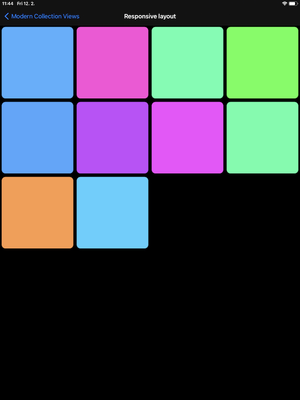
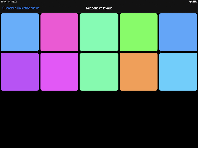
In practical terms, imagine you are building grid for photos or maybe document previews. Your app supports iPad and your want your collection view cells to be roughly the same size whether the app runs on iPad mini or iPad Pro 12" + correct sizes in landscape. This means that the number of items on each row needs to be dynamic so they can fill the width.
For example our goal is to have three items horizontally on iPad mini, four on the regular iPad and six on the biggest iPad Pro. And we want this number to grow if user decides to rotate their iPad and use landscape.
Why fractional sizing isn't enough
So far we have defined the problem and goals, so we can start with the implementation. We cannot use the otherwise very useful fractional sizing right away. Because if we were to define the item size like this:
let itemSize = NSCollectionLayoutSize(widthDimension: .fractionalWidth(0.25), heightDimension: .fractionalHeight(1.0))
Then we would always have four items (because 1 / 0.25 = 4). So on the iPad mini the items would be too small and on iPad Pro they would be gigantic.
Using layout environment
Instead we need to do a bit of math to figure out, what the fractionalWidth should actually be. For this we need to know the available width. This is perfect opportunity to use the NSCollectionLayoutEnvironment which we get passed in if we select specific UICollectionViewCompositionalLayout initializer.
In this example I am going to use the sectionProvider initializer without the config and pass in this method:
func layoutSection(forIndex index: Int, environment: NSCollectionLayoutEnvironment) -> NSCollectionLayoutSection
So the createLayout method looks like this:
func createLayout() -> UICollectionViewLayout {
    return UICollectionViewCompositionalLayout { [unowned self] index, env in
        return self.sectionFor(index: index, environment: env)
    }
}
That's the preparation done and we can move on to tackle the math problem.
Don't worry, we are going to just divide twice and round in the process. If we take the available width and divide it with the item size we would like to get, we get fractional result which tells us how many items we can fit in this width.
Since we cannot display for example three and a half items on a row, we need to round it and finally use this number to divide one which gets us the appropriate fractional width.
Calculating responsive size
In code it looks like this:
// approximate width we want to base our calculations on
let desiredWidth: CGFloat = 230
let itemCount = environment.container.effectiveContentSize.width / desiredWidth
let fractionWidth: CGFloat = 1 / (itemCount.rounded())
let itemSize = NSCollectionLayoutSize(widthDimension: .fractionalWidth(fractionWidth), heightDimension: .fractionalHeight(1.0))
The resulting collection view cells won't be exactly 230 points wide, but they will be fairly consistent across all the possible screen sizes and orientations. And we don't have to worry about detecting the rotation, Compositional Layout will do that for us.
And with this our responsive layout is done. This isn't the only solution to this problem, but I think it works pretty well. And if you tuck it away into an extension, you can reuse it across the project without thinking about the math again.
Extension
For example this is extension I came up with. Once again confirming that naming such generic stuff is not easy 😄
extension NSCollectionLayoutDimension {
    static func fractionalWidth(forTargetSize size: CGFloat, inEnvironment environment: NSCollectionLayoutEnvironment) -> Self {
        let containerWidth = environment.container.effectiveContentSize.width
        let itemCount = containerWidth / size
        let fractionWidth: CGFloat = 1 / (itemCount.rounded())
        return Self.fractionalWidth(fractionWidth)
    }
}
Complete code example
Full code is available on GitHub in my example project.
Uses: Xcode 12 & Swift 5.3
Follow on Bluesky to not miss new posts

iOS blogger and developer with interest in Python/Django.