5 tips for better App Store screenshots
Whether you are preparing to publish your first app or want to improve screenshots for already published one, I hope at least some of these tips will be helpful.
Published: Dec. 6, 2021 SponsoredDiscover new games to play, organize your library, read reviews and more.
Show the most important parts of the app
Before you even create screenshots, think about which screens of the app are the most used and prominent. For a hypothetical podcast app this would likely be the currently playing screen, list of all the current episodes and possibly screen which lets you search for new shows.
I think it does not make much sense to showcase about screens and similar which maybe most users won't even visit.
For example below are the first two screenshots which my app SwitchBuddy presents on the App Store. Its main job is to transfer screenshots from Nintendo Switch game console to the iOS device. So my first screenshot shows the initial connect page used to connect to the console and the second one shows gallery screen after everything has been successfully transfered.
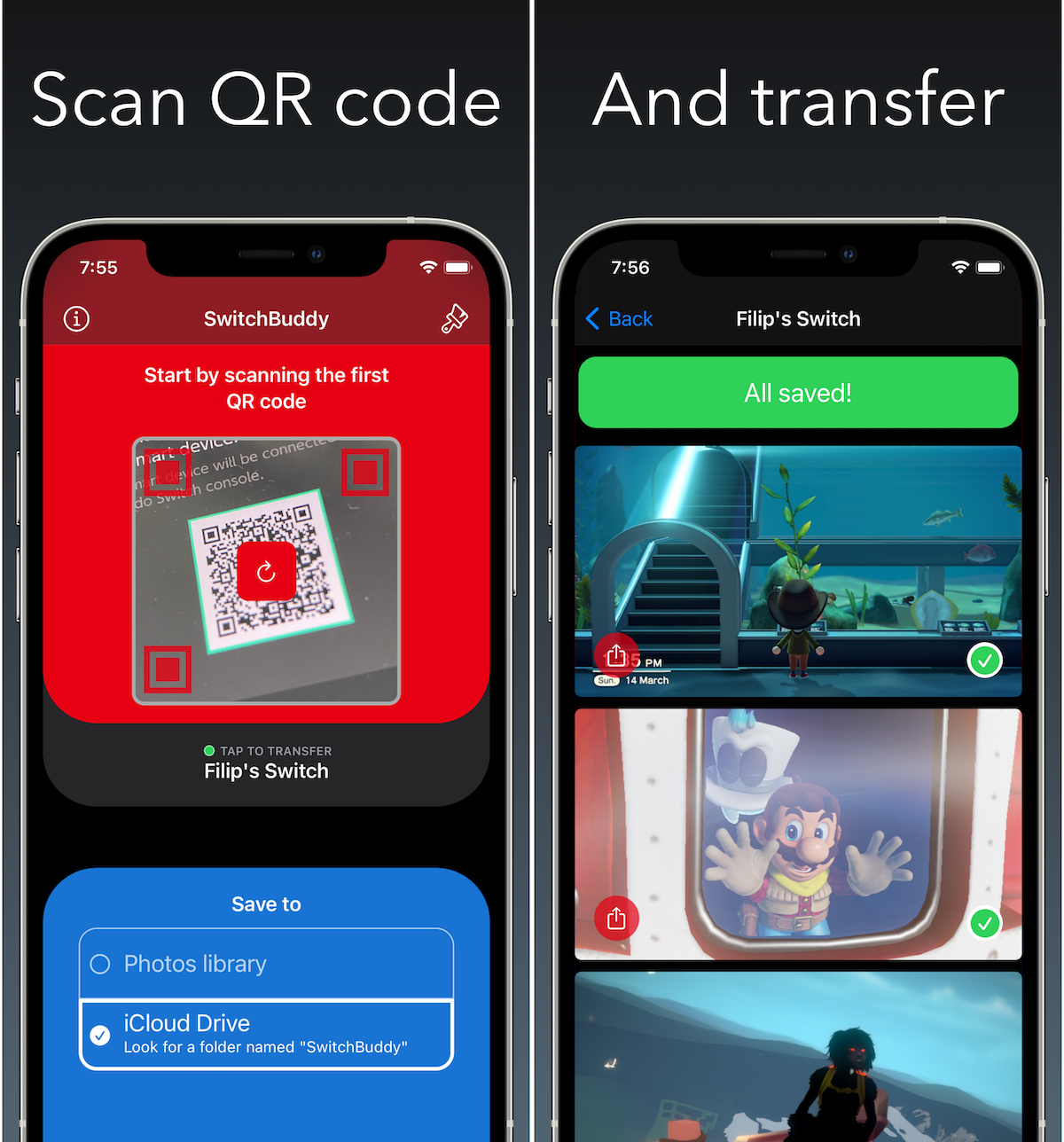
Since this is a small app, I have just four screenshots on the App Store. Those two I mentioned, then how-to section and page to select theme and icon.
Show the best scenarios
This is very important if you app relies heavily on user-generated content. Like list of to-dos, the mentioned podcasts, new articles in a case of a RSS reader and similar. Take your time and prepare great looking demo content you can use for screenshots later. This means enough of sensibly named to-dos for tasks app, varied selection of popular podcasts for the podcast app..
Again showing empty views or just a small amount of content should be a no-go. For some of my apps I have code that detects if app runs in a Simulator and automatically loads demo content - this makes creating screenshots with updated design super quick.
If we return to the example screenshots above, I am presenting successful connection to the Switch on the first one and then successful screenshot transfer on the second one. Giving the user and idea how it should work.
Keep it consistent
If you decide to create screenshots with background and texts - keep the background and font consistent across all your screenshots. Different background for each one takes away attention from your app and it doesn't look good.
Same goes for the text. I would use at max two font sizes - assuming you need multiline text for example.
Mind the details
Although some folks always make sure status bar shows "9:41" as the time and battery is full along with full network indicator - I am not among them. However what really stands out is that if your device is charging and the battery indicator is green. I always try to avoid this.
Similarly be on the lookout for the "back button" to return to previous app.
Check popular apps for inspiration
Feeling stuck? Check what kind of screenshots other apps are presenting. Maybe you will get inspiration for fresh visual style. On the other hand, don't stress too much over this "competition". Popular apps with teams behind them have screenshots made by professional graphic designers so as an indie developer it doesn't make sense to compare yourself to them.
Follow on Bluesky to not miss new posts

iOS blogger and developer with interest in Python/Django.